I was approached to make a logo for a new business in the landscaping/land management industry.
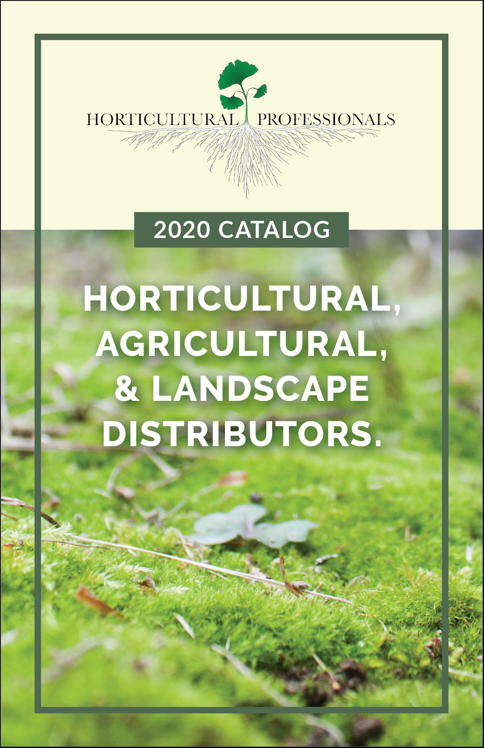
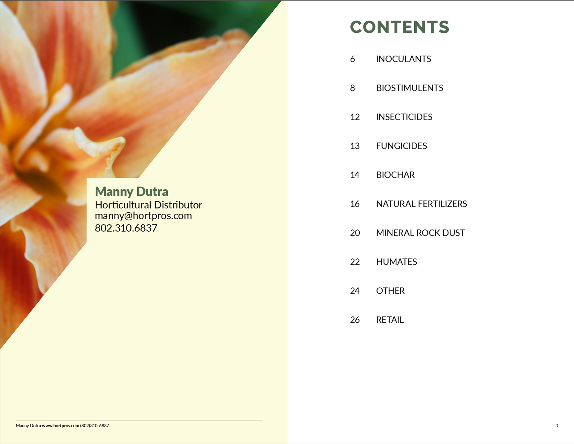
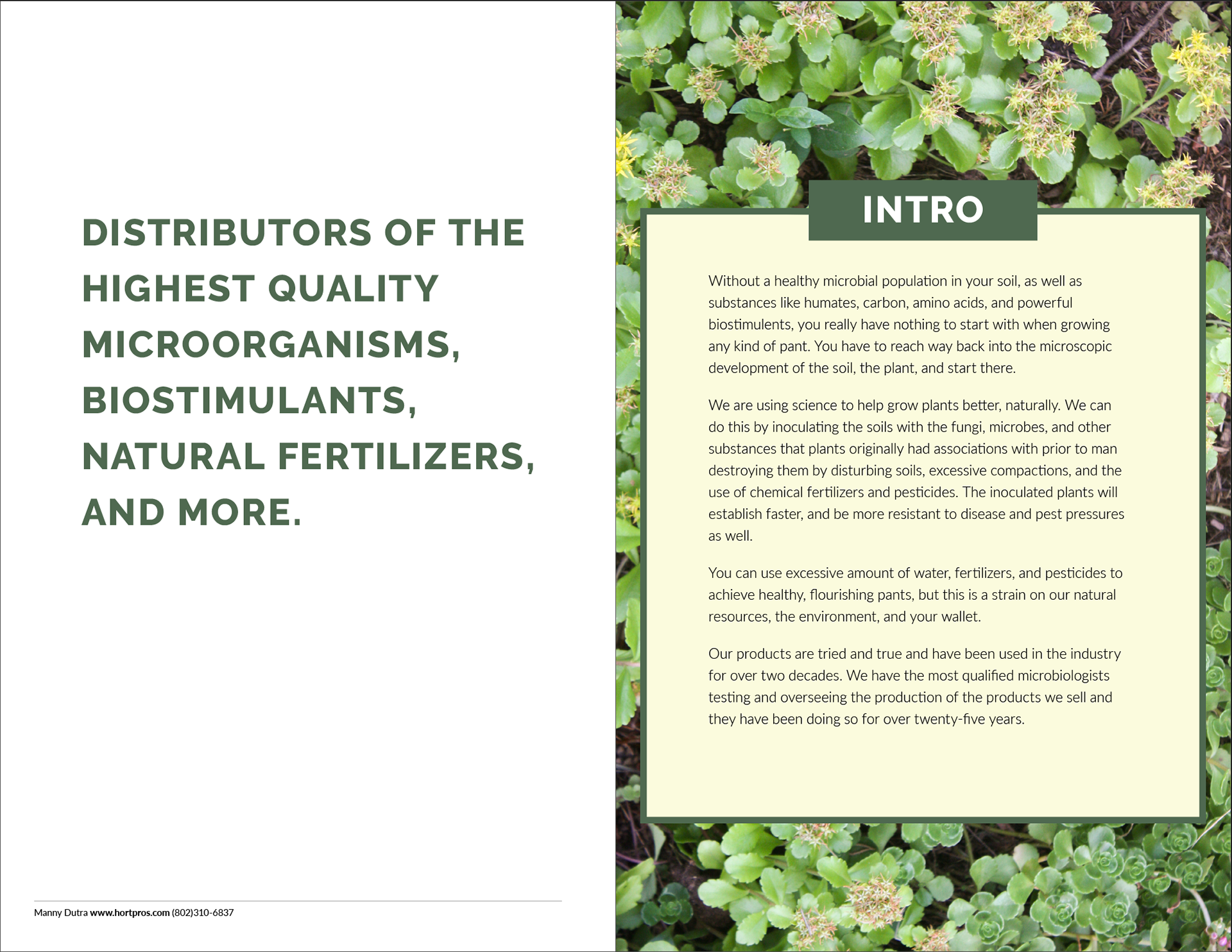
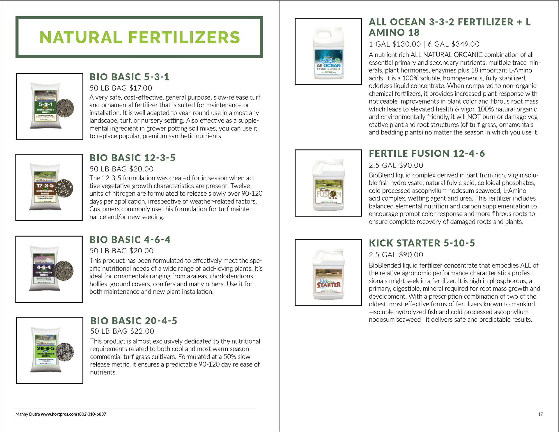
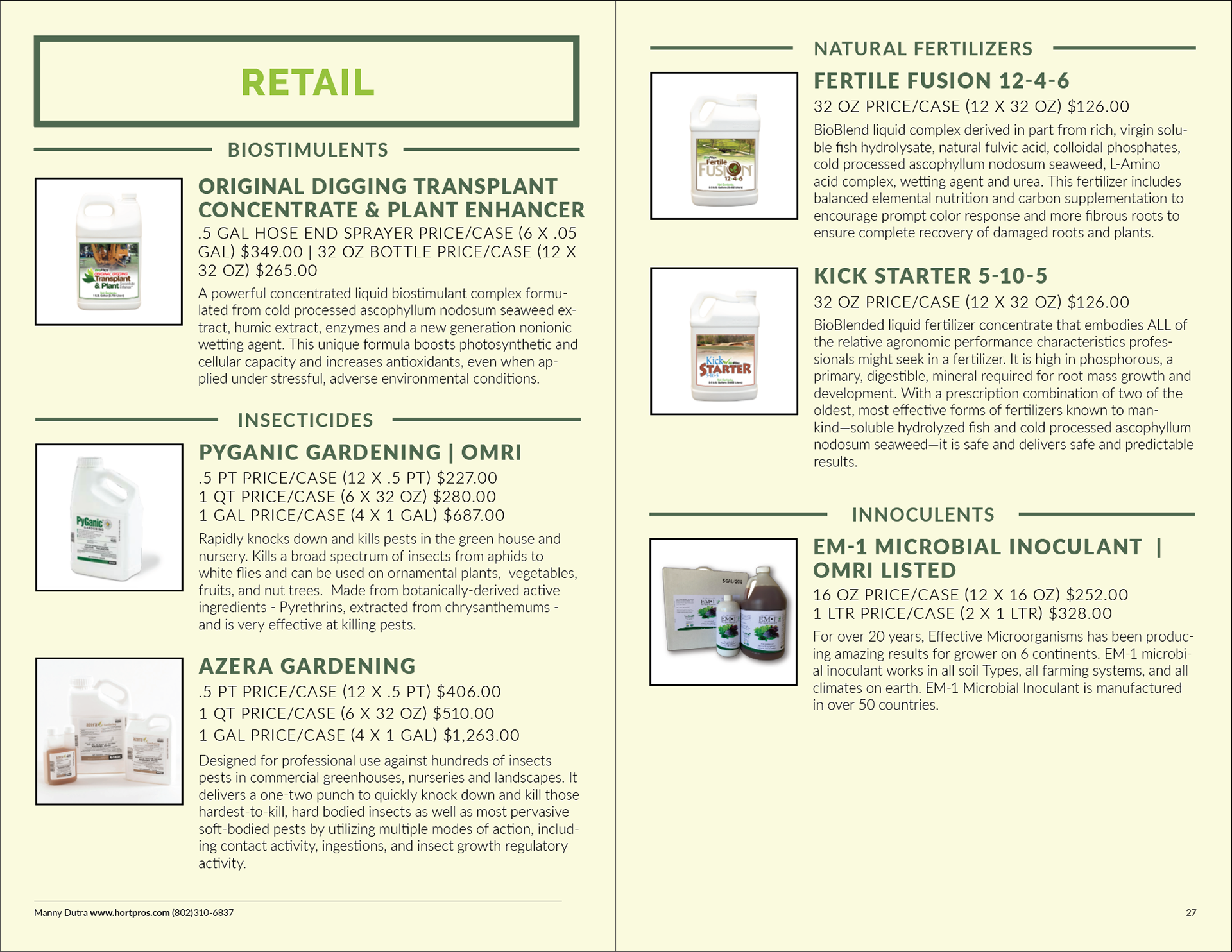
A horticultural distributor was tired of printing stacks of paper to hand out at trade shows only for them to be lost or recycled. I worked with him to update/rework his website and create a product catalog. More consistent branding was developed with typography, color, and blocks across both platforms. I took new images for the website and changed the layout of the pages. I built a simple grid for the catalog and focused on upfront and concise information.
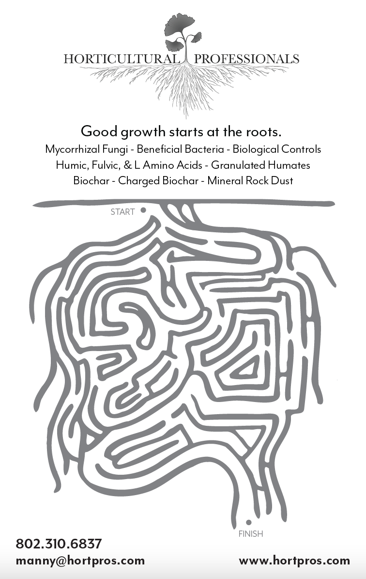
A black and white ad for for a business that supplies products to improve plant growth to be placed into a guide for the Northeast Greenhouse Conference & Expo.
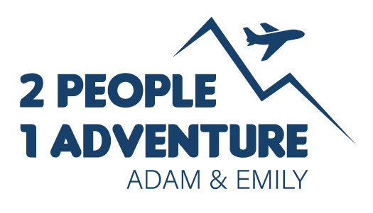
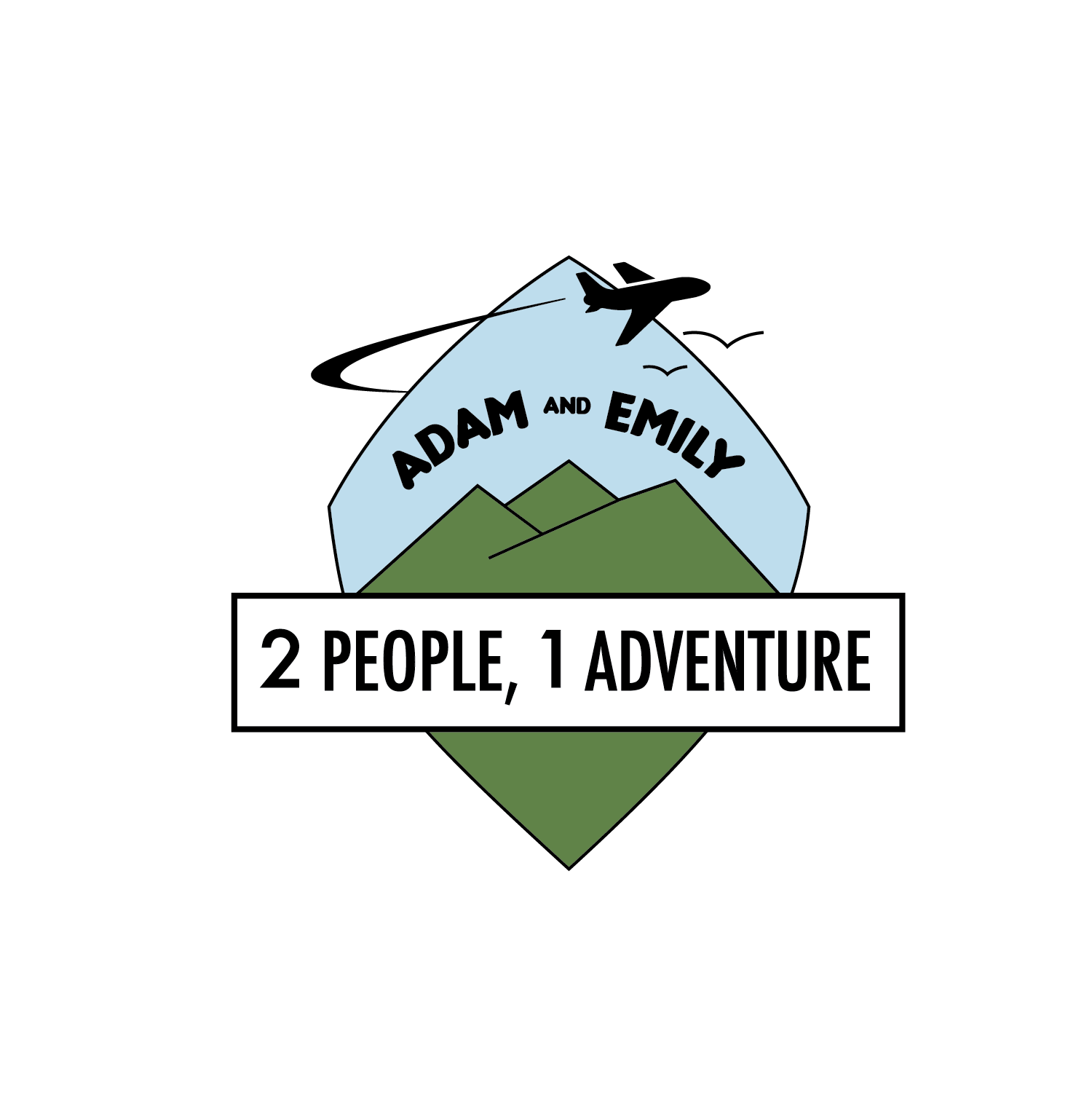
A young couple with a passion for exploring contacted me to do a logo for their blog. They were torn between two logo styles but wanted to incorporate travel and hiking along with the blog's title and their names.
A friend of mine started a blog called Keep it Simple: exercise, diet, health. His blog covers a wide range of topics, all relating to fitness and well-being. He reached out to me to create a logo, and my goal was to create something that was all encompassing but different than the many health/fitness logos already out there. Clean, simple, and serious without being daunting, brought me to the conclusion you see below.

My first ever freelance job, mentioned for nostalgia. This logo was for a land maintenance company.